
Looking Back at Mega Man Cover Art, Vol. 2

LBD "Nytetrayn"
It’s time for another edition of “Looking Back at Mega Man Cover Art”! I’m your host, LBD “Nytetrayn”, and this week, we’re taking another gander at three pieces of Mega Man box art from the vaults! And remember, any entry in any region is fair game!
For the rundown on how this all works, be sure to go back and check out Volume 1 of what will no doubt be a long-running series whenever I’m not sure what else I should write about.
Now, let’s see what the Dice Rolls of Destiny have in store for us this week. Will the most infamous box art of all-time be featured in this edition? Read on to find out!
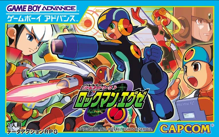
Well, this is timely. Kind of. With Mega Man Battle Network Legacy Collection doing the numbers upon its release this year, what better time to look back at where it all began — and with the original Japanese version, Battle Network Rockman.EXE, no less?
Yes, last time. That is correct. But let’s not get hung up on the details.
If there’s one word that can describe this box art, it’s busy. No fewer than nine characters adorn this tiny rectangle of space, some overlapping others so that you can barely tell that they’re even there (Hi, WoodMan!).
As to what’s even going on? I’m not sure if it’s anything, really, though I suppose one could posit that Lan and MegaMan (or Netto and Rockman, if you must) are engaged in some sort of NetBattle with Chaud and ProtoMan (no, I’m not doing that for everyone), though the way MegaMan and ProtoMan are kind of looking past each other suggests otherwise. With Lan prepping his next Battle Chip, it is a decent showing of the core gameplay element of the title. Meanwhile, I guess GutsMan, NumberMan, Roll, WoodMan, and Glyde are all just running out into the field during the match?
It kind of makes me want a Mega Man Battle Network Battle Royale, honestly. No, I have no idea how that would work, but I’d give it a go.
Incidentally, I always found it kind of interesting that the Japanese version retained the character’s full nomenclature, “Rockman.EXE,” while the English versions dropped the “EXE” part. Considering it seems like they drop it in-game eventually, anyway, I guess the English side knew what was up for once.
The logo is new, and stands apart nicely from the series that have come before it, and the inclusion of MegaMan’s insignia there is a nice touch. The mirrored edges showing the Game Boy Advance and Capcom logos round things out nicely, and there’s even a bit informing prospective buyers that this title is a role playing game, which was unheard of at the time for the series.
There’s a lot going on here, but it all manages to harmonize pretty nicely to kick off a new series — heck, maybe even a new era — of Rockman in Japan.
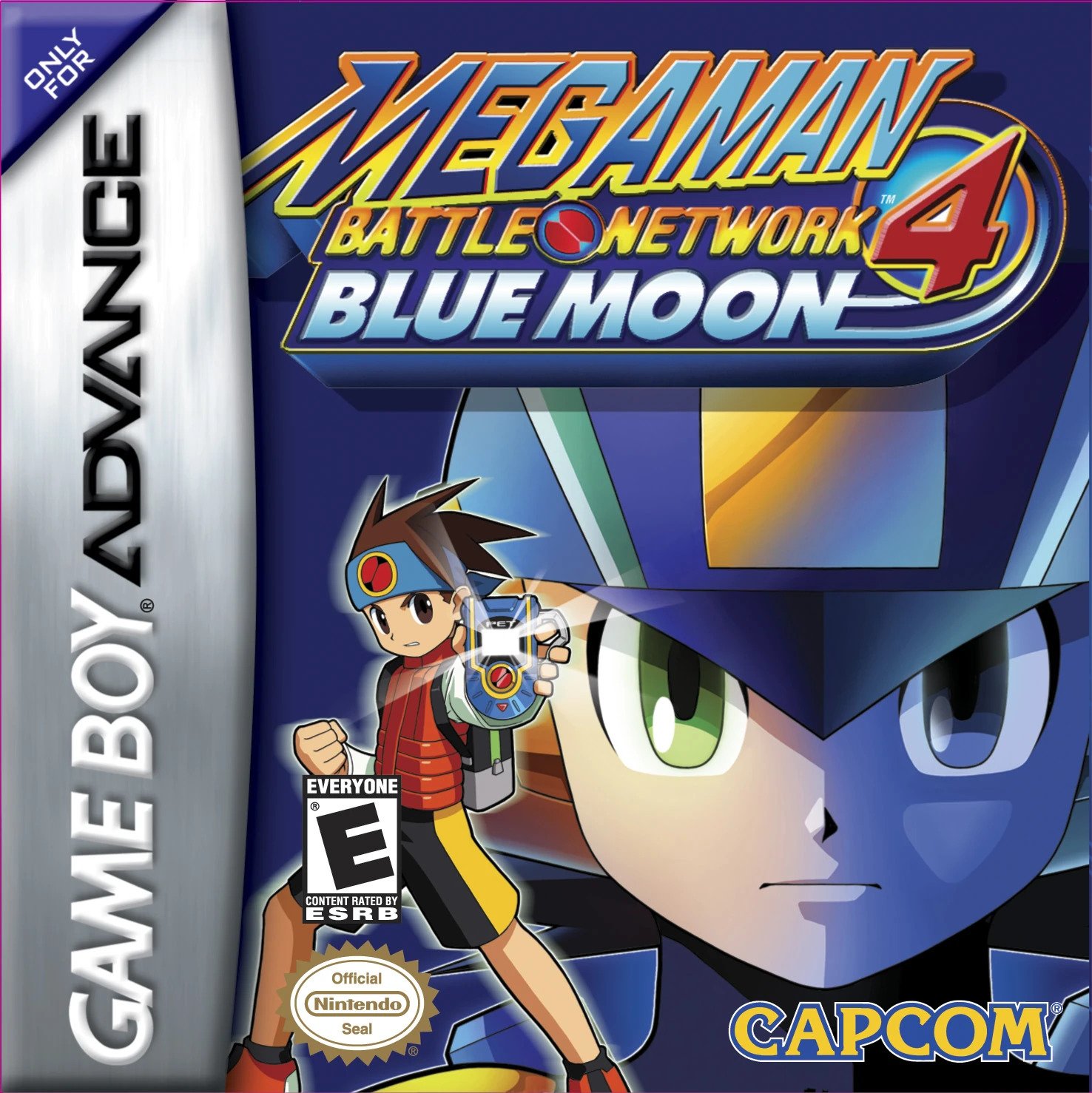
Two covers from the same series? Well, it was bound to happen sooner or later. At least this one’s the North American version, so it has that going for it.
For the most part, it seems that the non-Japanese counterparts to the series’ box art are a bit less busy than in the games’ country of origin, and Mega Man Battle Network 4: Blue Moon is no different in this regard. What we have is a close-up of MegaMan’s face, half of which is tinted by a blue color that is evocative of this version of the game’s title. And honestly, I don’t know how I feel about it. Is it too much blue around a character who already sports so much of it, he’s known as the Blue Bomber? Maybe. It certainly works on some level, and provides a nice contrast to its sibling version, Red Sun, which provides a nice contrast to MegaMan’s colors in itself. Maybe there’s some sort of personality test to be made based on which cover you prefer.
Standing out in front is Lan Hikari, showing off the all-new Advanced PErsonal Terminal, or PET (available in stores now!).
I don’t know. I feel like maybe there’s more that the cover should say here, but doesn’t. Sure, it’s the fourth game in the series, so you should probably have some idea of what you’re in for by now. At the same time, every game is someone’s first.
What’s more, there’s a fair bit going on here which sets it apart from those which came before it, kicking off a new direction for the back half of the series. While Mega Man Battle Network 3 had two versions as well, the way this game goes about it is more… genuine? The overarching story is the same, but many of the chapters are different between the two versions. What’s more, those also change upon replays in each version, further differentiating the two. And that’s without getting into the new characters, revamped graphics, the Dark Chips, the tournament setting, Duo coming to lay down some space “justice”…
There’s just a lot going on inside the box, and the cover does practically nothing to convey any of it.
All of this is to say that while the art itself is nice enough (more so when paired with its twin), that’s really more in a vacuum. As a means of selling a product, it tells you practically nothing. Maybe Capcom felt that with the MegaMan NT Warrior anime and manga running around this time, they didn’t really need to show or tell you anything more than “hey, it’s Mega Man“?
Finally, we come to our last entry for this edition. And I couldn’t believe my eyes when I made the dice rolls. With only the second edition, we’re already taking a look at the box art to the original Mega Man…
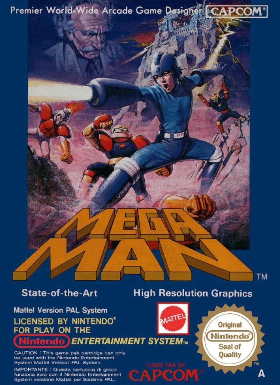
…from the PAL region. Ah, well. Let the suspense continue to build.
I can’t say I’m disappointed, though — I’ve always loved this box art for as long as I’ve been aware of it (which was some time after seeing the original, I should point out).
For as little information as we had on Mega Man at the time, this is a pretty solid representation, albeit more realistic than the version we would come to know and love. The outfit is mostly right, albeit with a few white embellishments here and there. He has an arm cannon. He’s blue. And we also get to see three (and a half?) Robot Masters, who do well to represent their pixel art counterparts, Dr. Wily, and even Dr. Wily’s Robot Manufacturing Plant, a sight rarely seen outside of the Japanese art in those days.
In an amusing twist, the classic Mega Man logo is rendered in a sort of gold color that feels very much like the one used to illustrate the character in the US version’s box.
Along with all the various logos, warnings, and trade dress, what I really love about this one is how it all comes together to look very much like a lot of old retro movie posters like you would see back in the day.
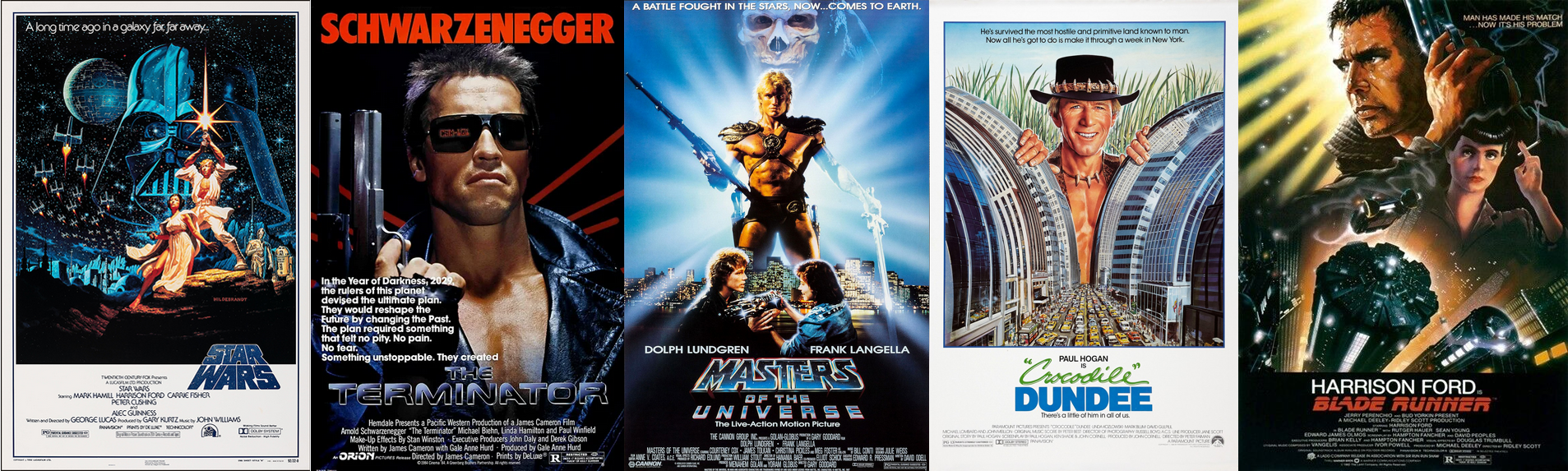
See what I mean? Of course, this was a practice not too uncommon among a lot of video game box art as well — even games whose graphics could come nowhere close to approximating what was seen on the box.
As a result, this is a piece I’d definitely love to have hanging on my wall. I mean, that’s most Mega Man box art, but this one’s definitely in the upper-tier for me.
—
And that’s the second round! What will come next? Stay tuned, and find out!
Thanks for reading! And please let me know if you have any thoughts on this new feature! Is three too long? I certainly got more mileage (read: word count) out of this than I expected, so maybe one at a time would be better? Then again, that introduction took up a bit of space, so maybe it’s not that bad?
Also, in case you haven’t heard, re-upping our hosting for the next few years took a big bite out of our bank account, so if you like what we’re doing here, and can kick in a few bucks to our Patreon or buy us an E Tank on Ko-fi, we’d greatly appreciate it!
Mega Man images via The Mega Man Knowledge Base and Mega Man Legends Station.
David Oxford, or “LBD ‘Nytetrayn’,” as he is sometimes also known, is a freelance writer of many varied interests who resides in Toronto, Ontario, Canada. If you’re interested in hiring him, please drop him a line at david.oxford (at) nyteworks.net.
For a full list of places to find him online, click here.
Prev/Next in Category(s)
Prev/Next by Date

The Script for Mega Man Legends Timelines #1
Behold some of the first steps in how this book came together.

GOG Dreamlist Brings Back Breath of Fire IV, Could Mega Man Legends Happen Next?
Plasma Power? No, People Power!


Comments