
Looking Back at Mega Man Cover Art, Vol. 1

LBD "Nytetrayn"
This week, we’re introducing a new recurring series here on The Mega Man Network! “Looking Back at Mega Man Cover Art” is more or less what it sounds like on the tin, wherein I take a look back at the various Mega Man cover art throughout the years and give my thoughts and critiques on each. As a wise man once said, “I may not know art, but I know what I like.”
But wait! Sure, it says “Mega Man” on the tin, but that’s not limited to just North American art, but PAL and Japanese versions, too!
Of course, with so many boxes, a single feature simply won’t do — it would either have to be a bajillion words long, or I’d have to be really brief in my assessment of each. So we’re making it a series, and I’ll look at three pieces each week. A nice number, three is… ahem.
And to make things a bit more fun and unpredictable, the three pieces of art examined each week is going to be randomized! That will keep things from feeling too obvious, and maybe even add a little suspense. When will I do the infamous North American box art for the very first game? Will it be this week? Or some other time? For what it’s worth, I’m writing this before I’ve chosen the subjects this week.
How will the subjects be chosen? Why, through dice rolls, of course! Or at least, as much as possible. First roll determines the series by chronological release: A 1 is Classic, a 2 is Mega Man X, 3 is Mega Man Legends, and so on. Then I’ll try to roll an appropriately-sized die to determine which entry. For instance, Classic’s 11 titles will necessitate a 20-sider, while I can use a 4-sider for Mega Man Legends, Mega Man Zero, and Mega Man ZX. *sigh* For those with two versions, I’ll do a coin toss.
There’s other minutiae, including wildcard slots for side-games, but you get the picture.
Now, let’s see what this inaugural week has in store for us…
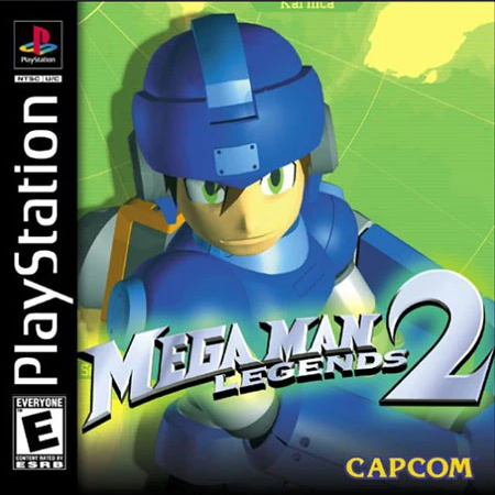
Ah, now here’s a bit of a Monkey’s Paw to start us off. It’s no secret that I have a special place for Mega Man Legends in my heart, and the second game in the series does have one of my favorite pieces of packaging art in the entire franchise. Buuuuuuuut… the North American version isn’t it.
Now, don’t get me wrong — I don’t hate this box art (which is largely shared by the PAL release, so this entry is counting as both) by any stretch. But given the choice, I’ll take the Japanese box art every time. But we’ll discuss why that is when we get to it. For now, let’s focus on the piece before us.
Taken on its own? I like it. It follows the trend of 3D versions of the lead character adorning it that was the precedent set by Mega Man Legends and The Misadventures of Tron Bonne. As a result, the trilogy (such as it is, with two main entries and one spin-off) has a nice, unified look that’s distinct from anything else in the series. They truly look like they belong together as a set.
Another touch I rather enjoy is the visual of the map behind MegaMan, which gives the sense that this is more of a globetrotting adventure than its predecessors. That’s only true to a certain degree, as the places you visit are all confined to a relatively small corner of the globe, but the other two took place on only one island each, so close enough, right?
The 3D model of MegaMan Volnutt tends to get a lot of hate, but between the era it was created and the design they were working with? I don’t think it looks too bad. MegaMan Volnutt’s design only has so much detail, and it seems to all be accounted for here, maybe even more clearly than in the game itself. And considering that as near as I can tell, Japan didn’t use these models, the fact that they didn’t just reuse the model from the first Mega Man Legends is a plus. Points for effort!
Should I talk about the logos, too? Well, I will this time, and you can tell me what you think for later (I’m sure I’ll have many more chances with today’s other two entries’ respective series than I will with this one).
I have mixed feelings about the Mega Man Legends logo here, the 2 notwithstanding. On the one hand, it’s basically just the stock “Mega Man” logo of the time with “Legends” slapped underneath, so it doesn’t really carry much of a visual identity of its own. On the other hand, it’s the same logo that Classic and X were sporting throughout a good chunk of the ’90s, so it does make it look like another part of the overall brand. And yet, just prior to the release of the first Legends game, Mega Man X4 broke the mold with a new logo of its own.
So yeah, the logo has its ups and its downs.
Like I said before, I generally like this box art on its own merits, but it’s not my favorite.
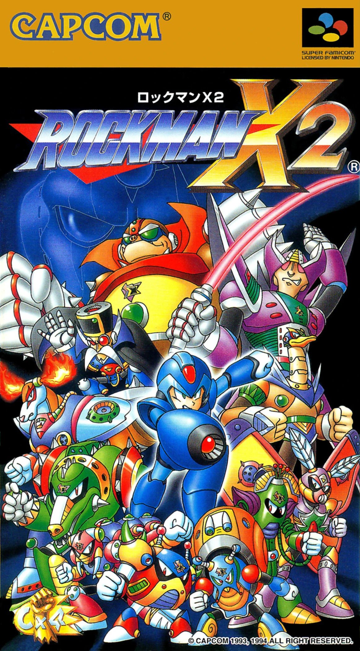
The box art for Japan’s Rockman X2 is rather fascinating, the more you study it. It tells you so much about the game, and yet, still manages to hide several things as well.
You don’t get to see X’s new armor, for instance — that’s reserved for westerners, for one reason or another. It’s raises an interesting question with regards to the decision to use a more Mega Man-like design for the hero. That is, does that Blue Bomber recognition not matter as much outside of Japan? Were they so worried that people might eschew the game if X was armored up, rather than looking more Mega Man-y?
You also don’t get any real indication of the plot, particularly with regards to the return of Zero. And yet… look at the blue silhouette in the background. Sigma’s back, and they aren’t hiding it. But then again, if you wait a few moments after the credits of the first game, you’d know that already, so maybe they figured that was good enough to say the jig is up?
For the rest, you have the eight Maverick bosses, as well as the three more active antagonists of the game, the X-Hunters. It’s a nice layout of X and almost all of the main challenges he’ll face throughout this mission. And yet, you look at X himself… and the way he’s facing away from this threat, almost leaping away. Naturally, you want to display the face of your hero, so that’s understandable, but it almost looks like he’s leading the group, or possibly even running away. I suppose the white outline is meant to divorce him from his surroundings to a degree, but does it get the job done?
Finally, one thing I don’t think I ever noticed until doing this piece was the logo in the lower-left corner: Cx4, placed atop a fist and fireball icon. This, of course, refers to the Cx4 mapper chip installed within the game cartridge, whose added power allowed for the mapping and transformation of wireframe enemies such as Chop Register and the Sigma Virus.
This is good as package art goes. It tells you a lot, but not so much that there aren’t some surprises left in store for when you play.
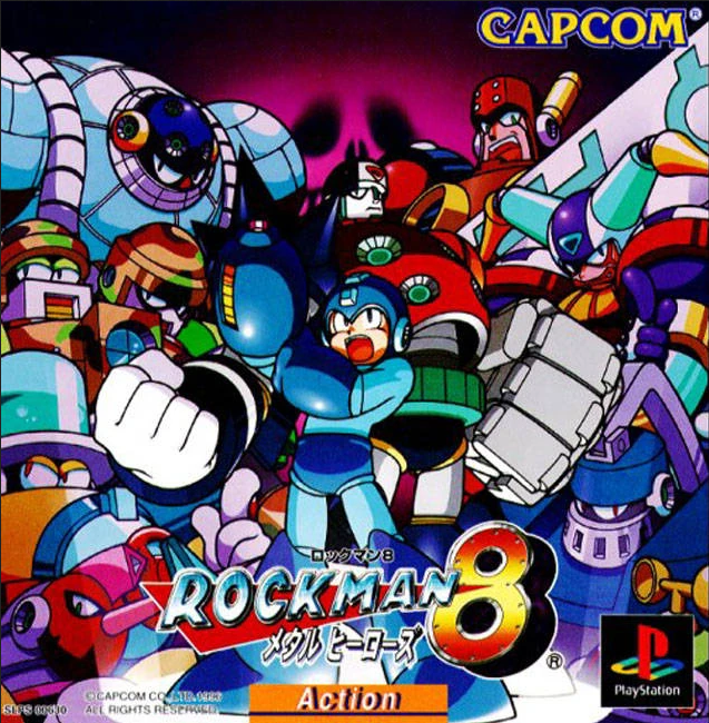
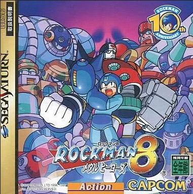
Finally, we have the Japanese Rockman 8 package art, for the Sony PlayStation and the SEGA Saturn. While it’s not my favorite, this game has definitely grown on me over the years.
This shares a lot in common with the Rockman X2 box art, which stands to some reason, as most Rockman box art had been following a certain template of sorts up to this point. We get the eight Robot Masters of the game featured, of course, though poor Astro Man seems to get blocked out, no matter which platform it is. I feel like collectively, this is one of the stronger rosters of Robot Master designs, which certainly helps things here. Instead of Sigma looming in the background, we have the spectre of the game’s main Macguffin, the Evil Energy. And front and center — and in the literal spotlight, no less — we have Mega Man.
I’m going to be honest: This is not my favorite picture of Mega Man. I love most of the art surrounding this game and the previous one, make no mistake, but this one always stood out to me because something just feels… off… about Mega Man himself compared to the rest of it. It’s almost like a weird hybrid of the then-contemporary Mega Man style and the puffier version we had in the earliest 8-bit releases. I can’t really put it into words. I don’t dislike it, but I don’t like it as much as most of the art that accompanies the game, either.
Joining Mega Man in — or rather, on the spotlight is our newest Metal Hero, the Star Marshal known as Duo! If you were so fortunate as to play The Power Fighters in arcades before this came out, then you had an inkling of who he is. Otherwise, he’s featured prominently alongside the Blue Bomber here, enticing you to find out more about this heroic heavy hitter. And unlike Rockman X2‘s art, there feels like a bit more of a separation between the Robot Masters and the heroes here, making it feel more like they’re looming large menacingly behind and around the heroes, rather than like they’re all a part of one big group shot.
For this one, I featured both the Saturn and PlayStation versions of the art, because I kind of like the classy look the Saturn border gives its respective version. This actually results in a little bit of the right side being trimmed to fit, but it doesn’t really cut off anything vital. Well, nothing that wasn’t blocked out already (sorry, Astro Man). The Saturn version here also bears the 10th anniversary logo for the franchise, which is a nice touch, and makes it feel a little more special. It’s the kind of thing that makes you hope the developers put their best effort into it for the occasion.
I suppose it’s also worth mentioning both have that “Action” tag at the bottom, which feels kind of obtrusive, and I don’t really care for it.
—
And that’s the inaugural batch! What will come next? Stay tuned, and find out!
Thanks for reading! And please let me know if you have any thoughts on this new feature! Is three too long? I certainly got more mileage (read: word count) out of this than I expected, so maybe one at a time would be better? Then again, that introduction took up a bit of space, so maybe it’s not that bad?
Also, in case you haven’t heard, re-upping our hosting for the next few years took a big bite out of our bank account, so if you like what we’re doing here, and can kick in a few bucks to our Patreon or buy us an E Tank on Ko-fi, we’d greatly appreciate it!
Images via The Mega Man Knowledge Base and Mega Man Legends Station.
David Oxford, or “LBD ‘Nytetrayn’,” as he is sometimes also known, is a freelance writer of many varied interests who resides in Toronto, Ontario, Canada. If you’re interested in hiring him, please drop him a line at david.oxford (at) nyteworks.net.
For a full list of places to find him online, click here.
Prev/Next in Category(s)
Prev/Next by Date

The Script for Mega Man Legends Timelines #1
Behold some of the first steps in how this book came together.

GOG Dreamlist Brings Back Breath of Fire IV, Could Mega Man Legends Happen Next?
Plasma Power? No, People Power!


Comments